


Case Study
HITsa
-

The client
Industry: Vocational Education and Training (RTO)
HITsa is a trusted South Australian Registered Training Organisation (RTO) delivering practical, job-ready training that helps people build confidence, capability and career success.
From short courses to qualifications, HITsa prepares people for work, helping them step into it with confidence, competence and career clarity.
-

The opportunity
HITsa partnered with Thrive Communications to transform an outdated and fragmented digital presence into a brand that truly reflected their scale, professionalism and impact. Their existing website lacked clarity, cohesion and strategic direction, failing to communicate their value proposition, purpose or credibility in a competitive training landscape.
Strategic FOUNDATIONS
We began by redefining HITsa’s strategic foundations to create a clear and compelling brand direction. This included the development of a new vision, purpose, values and guiding principles, alongside a powerful brand manifesto to anchor the organisation in meaning and intent.
This work repositioned HITsa as a credible, student-focused and industry-aligned training provider, bringing clarity to who they are, what they stand for and the impact they create.
Brand identity and GUIDELINES
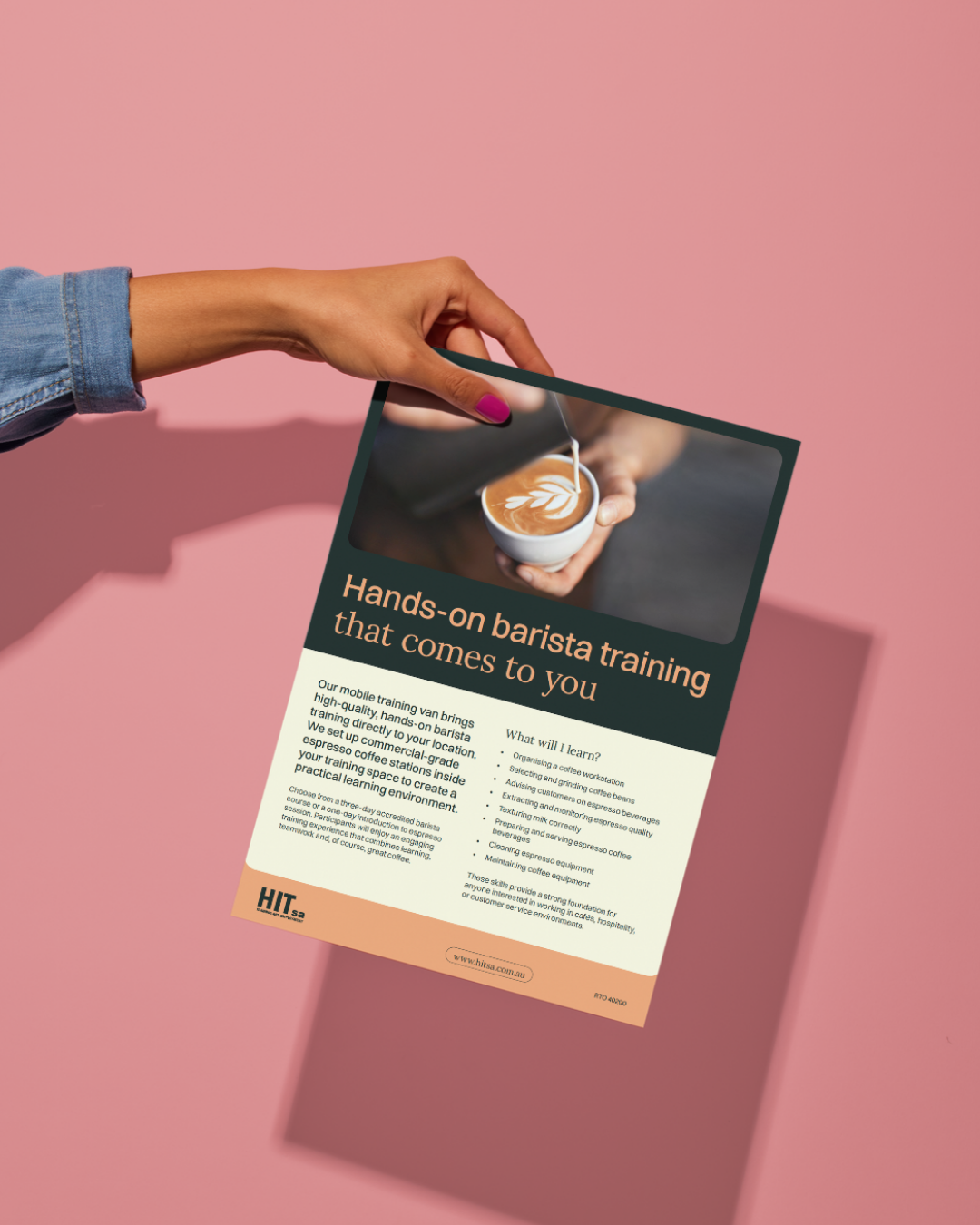
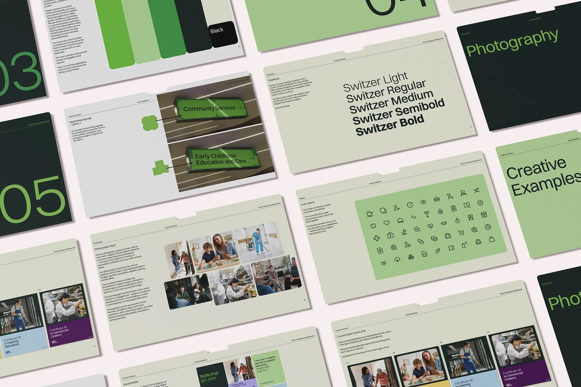
Building on this strategic foundation, we developed a distinctive and engaging brand identity, supported by comprehensive brand guidelines. Designed to be both memorable and meaningful, the new visual and verbal identity ensures consistency across all communications and enables HITsa to confidently cut through to their target market.
DIGITAL transformation
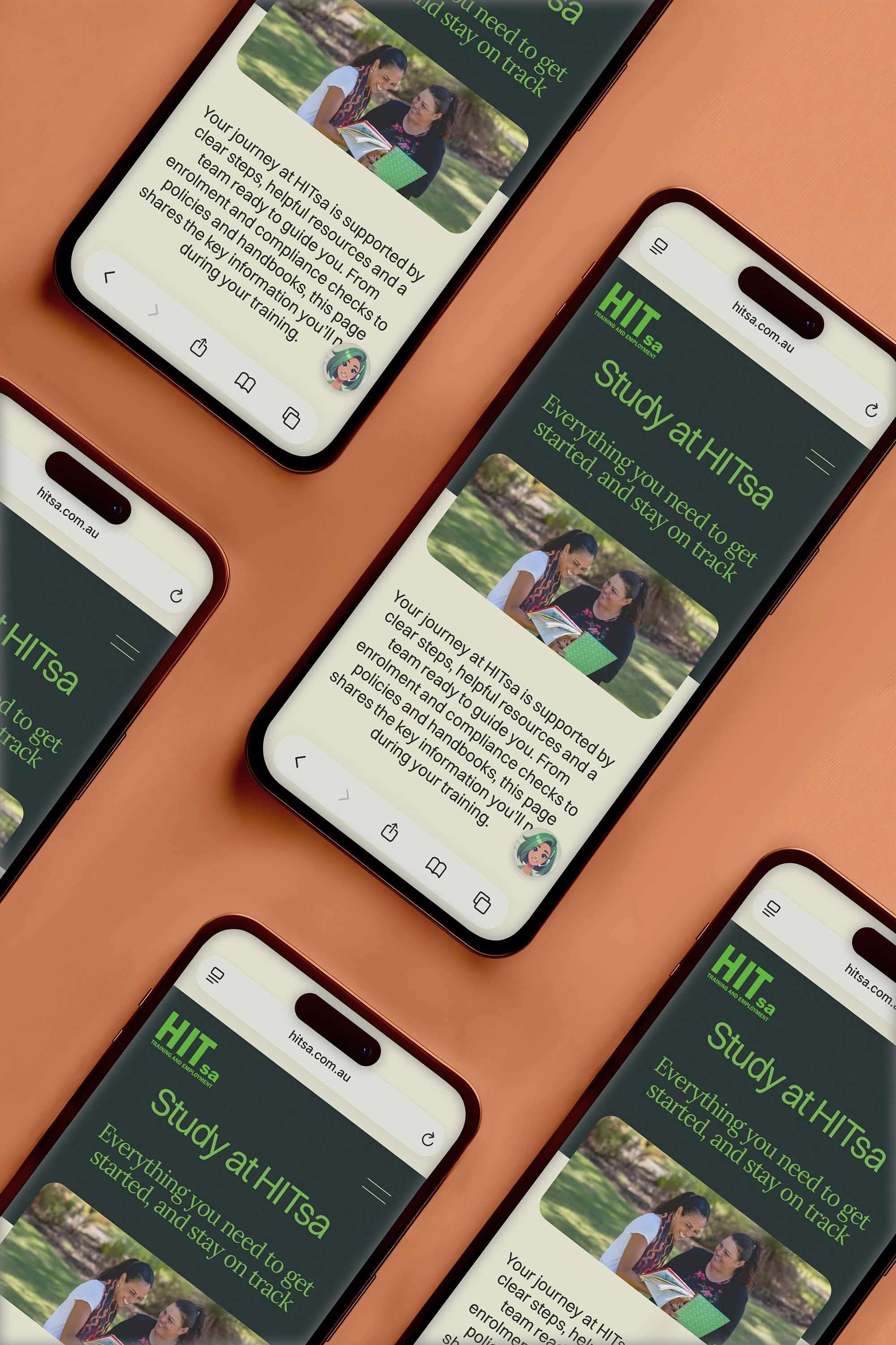
The new brand was brought to life through a high-impact website designed to inform, engage and convert. The site delivers a seamless user experience, clearly articulates HITsa’s offering and pathways, and positions the organisation as a trusted, professional and forward-thinking leader in the vocational education sector.


The OUTCOME
From digital platforms and campaigns to learning experiences, Thrive has helped transform how the organisation communicates, engages and delivers value, strengthening their ability to support communities now and into the future.
DELIVERABLES
Brand positioning and narrative
Brand identity development
Website design and development
Marketing collateral
Vehicle branding and signage